The Secret To Composing Amazing Pictures
Next to leveraging light to your advantage, the second component that makes a great image is composition. You may have heard the terms “rule of thirds,” “symmetry,” and “leading lines” but what do they all mean?
I love learning from Rebecca Yale, who explains her artistic choices on select Instagram posts. She describes the thought process behind her framing and it’s so fascinating!
In this post, I’ll walk you through each of these concepts so that you can create compelling images full of intensity and connection.
Rule of Thirds
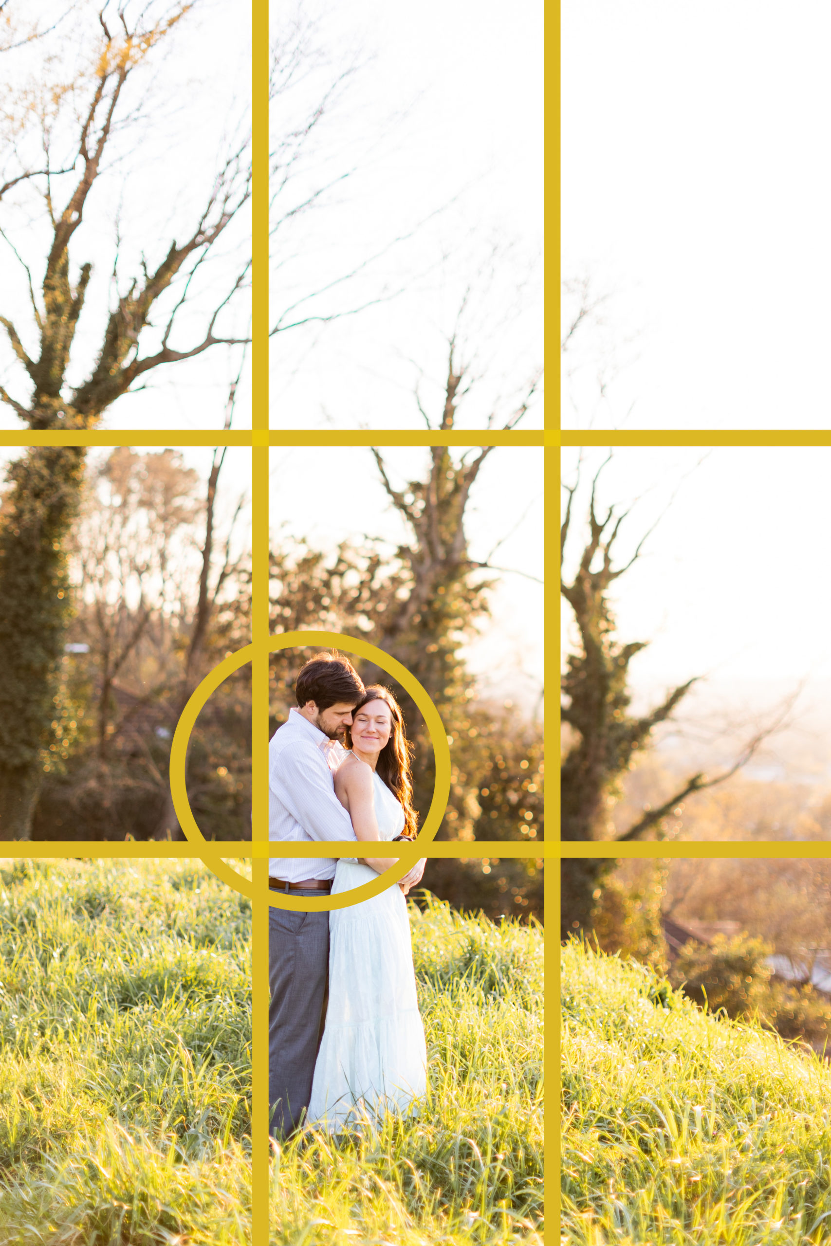
The rule of thirds is an age-old design concept. Just imagine drawing a grid on top of your photo with nine sections, like pictured below.
See how their faces perfectly intersect at two grid lines? The rule of thirds suggests that your focal point should land on one of the middle square’s four corners. This creates intrigue, features the setting and draws your eye in. It’s like you’re peering into a secret moment between two people … a little far back, but also art directed intentionally. The rule of thirds provides a helpful framework for photographers; you’re almost guaranteed a pleasing image when your subject intersects on the grid. Give it a try and see what you think!


Symmetry
At the very same time, rules are meant to be broken, right?
Let’s keep going with this same engagement session. The couple is placed directly in the middle of the image, giving a nod to the quiet street behind them, but creating a pleasing sense of symmetry on either side of them. It’s not perfect, because there are many differences between both sides of the image if you cut it in half. But the concept is this: break the rule of thirds and see what happens when you place the subject right in the middle!


Leading Lines
Did you ever grow up drawing horizon lines? Just me? I used to draw a triangle-shaped road that led to the sun. The road ended at the tip of the triangle, implying that the road got smaller the further away you traveled. It’s the same with this image!
Leading lines imply something. The stone wall leads your eye to the couple, then slopes down the hill to imagine what the sunset looks like as it reflects on the distant mountains.


These three concepts will provide you with a strong foundation for taking pictures. Break the rules, try combining concepts (rule of thirds + leading lines, symmetry + leading lines) and see what fits your storytelling the best. I love breaking rules and playing around, but I often come back to the basics.
Click here for how to work your magic with light on my blog “The Secret To Taking Amazing Pictures.”